Nido
UX web design
Moonpig
Look and feel
Freesat
Web design
Nido
UX web design
Agency - Tangent
Client - Nido
Year - 2017
Role - UX design
Nido offers student accommodation at universities across the UK. The particularity about it, is that it goes beyond just a place to stay. It's a social hub. A place for community. In 2017, they came to Tangent on the look for a new website that facilitated the user the exploration of their room offer as well as highlighting the social aspect that differentiates them from competitors.
At Moonpig, the design team was given the task of redefining the look and feel of the website and apps. The brief was to work in pairs to create different visual routes. I worked with Ellie Pujol, exploring colours, typography, layout, textures and iconography to create a consistent user experience.
Setting the goals
First thing I did was to set the main goals of the website and keep them as my north star:
- Better way of finding the right accommodation.
- Differentiate Nido from competitors by emphasising on its community aspect.
I didn't focused on the booking experience as this one was being held separately by other platform and it wasn't part of the brief.
I then proceeded into analysing the current platform, checking what was working and what was not, as well as determining if it achieved the main goals at all.
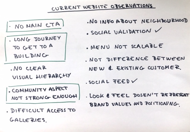
Competitor research
When I looked into what other student accommodation services where doing, I focused into looking for key features that could fulfill Nido's goals and user journeys from homepage to room details.
Based on the brief and our wider knowledge of the company, Ellie and I concluded that Moonpig's look and feel should embody the following characteristics:
- Friendly
- Approachable
- Crafty
- Fresh
- Clean
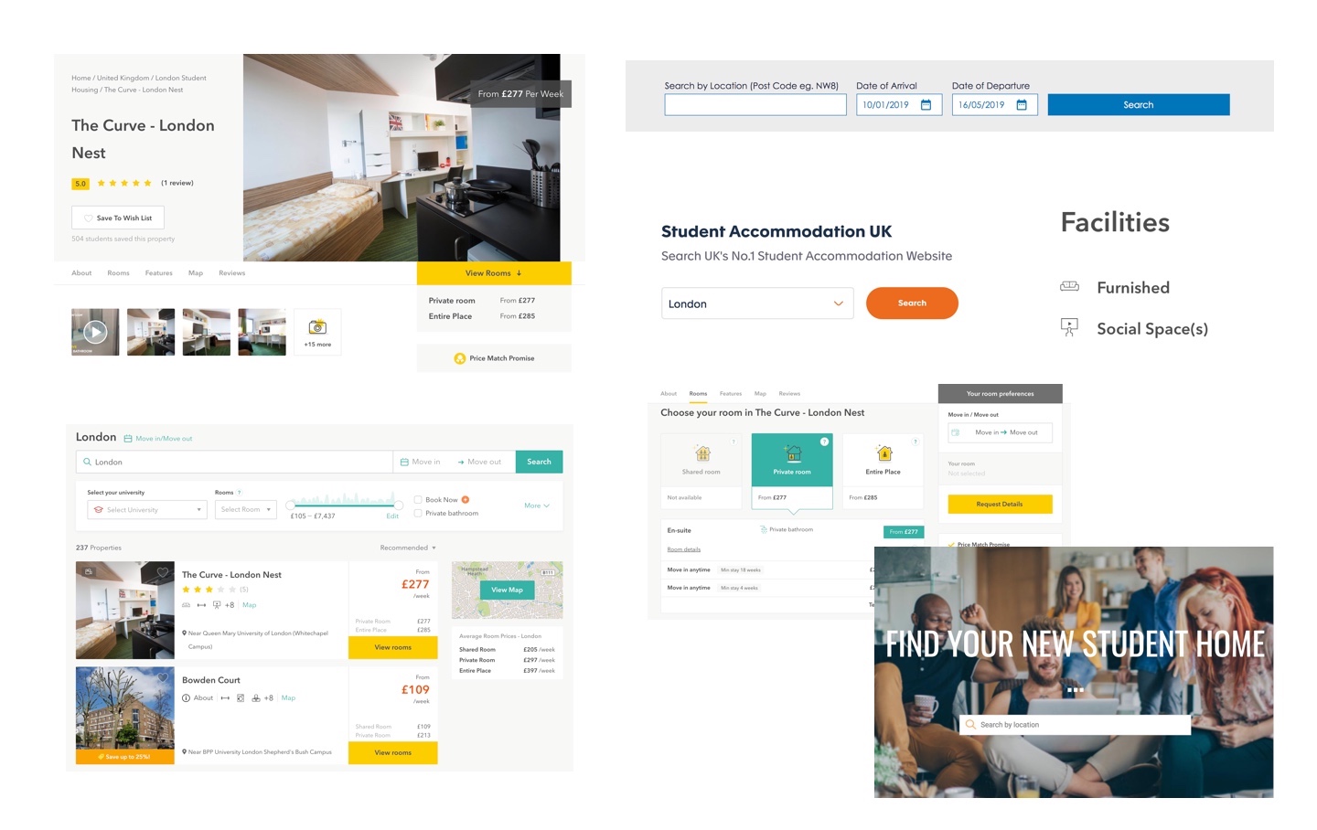
Examples of competitors.
Whiteboard exercise
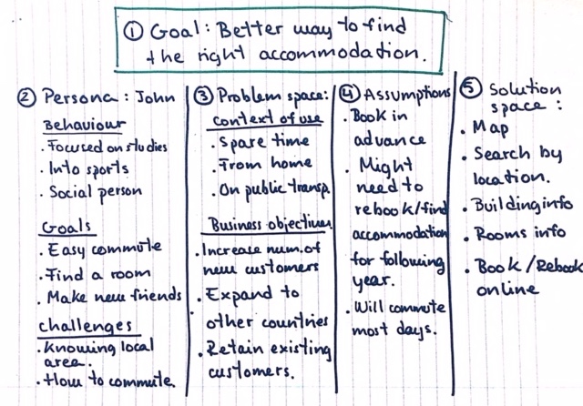
My next step was to focus on one of the main goals: creating a better way to find the right accommodation for a user.
I chose to do a whiteboard exercise focusing on a main persona that had been previously generated from the study done by the UX research team.
I divided the board in five sections: goal, persona, problem space, assumptions and solution space.
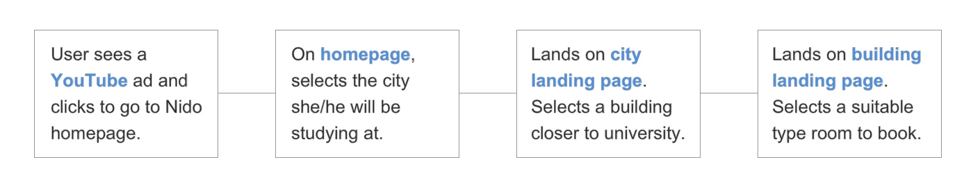
User journey
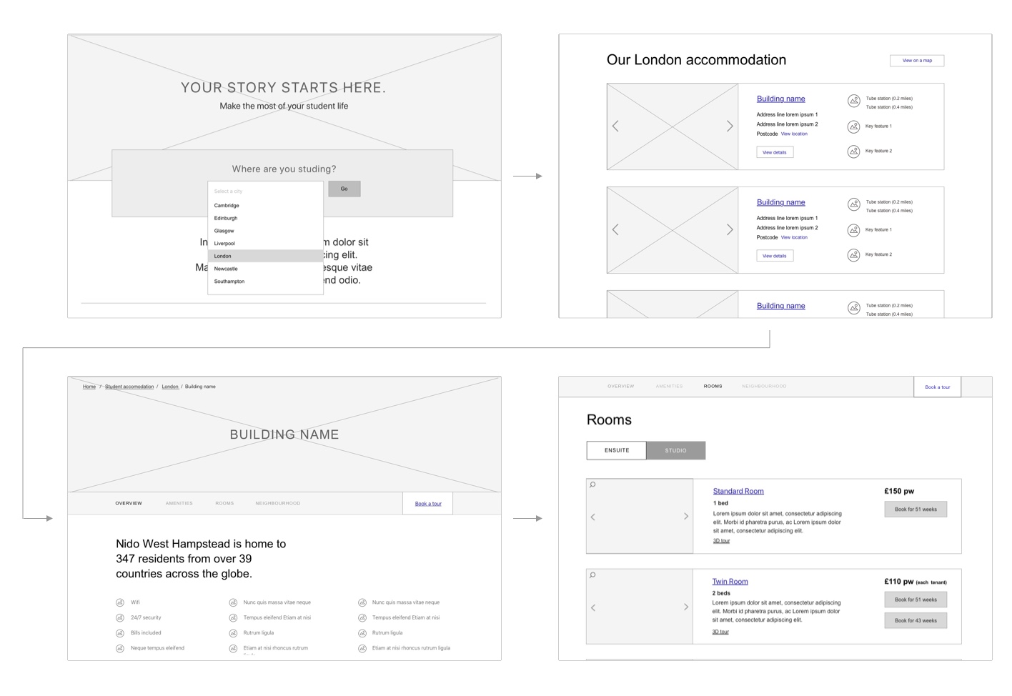
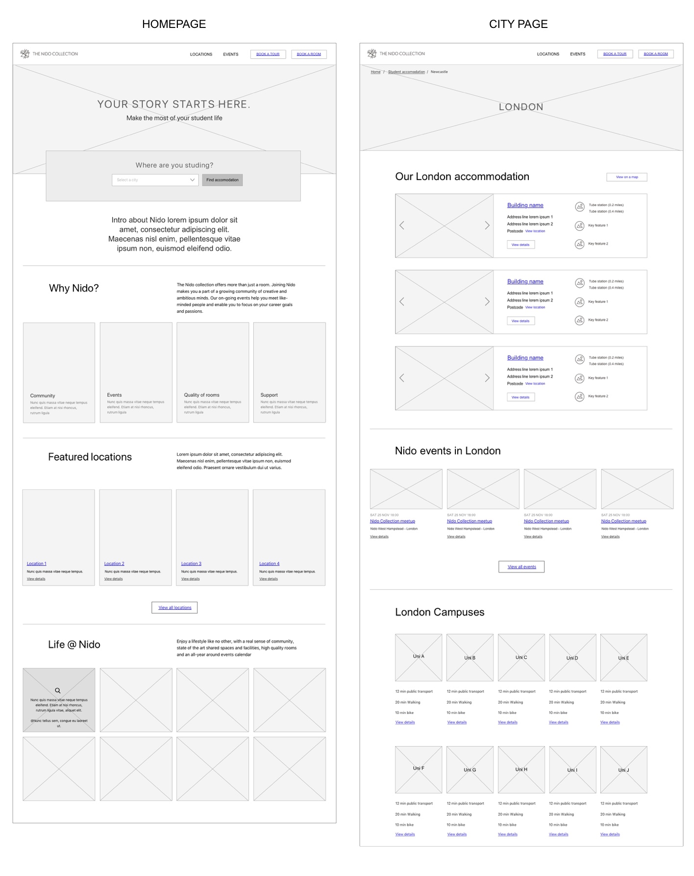
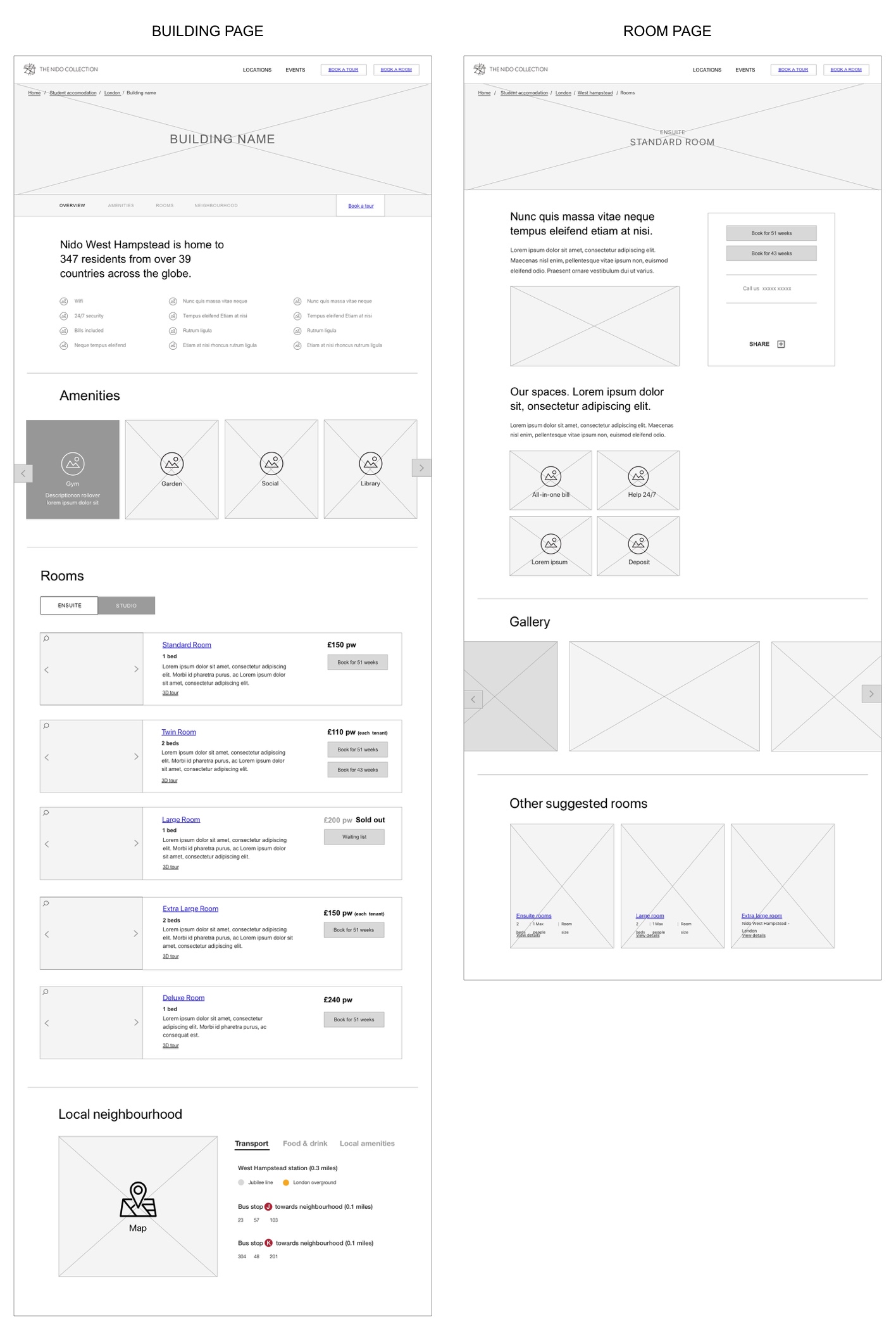
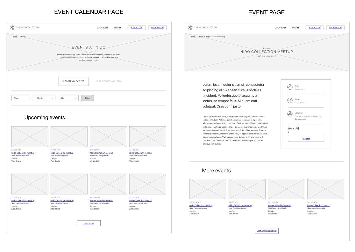
I desgined a user journey based on the notes from the whiteboard exercise and some early sketches of it. The journey consisted of a new user finding a suitable room where I tried to reduce the steps as much as I could.
Wireframing
I devoloped the sketches into higher fidelity wireframes as well as other pages of the website where introduced further functionality to cover other aspects that needing solving.
More projects

Media share and managementStreamYard iOS app 2024

Crypto platform redesignQredo 2023

Defining a new look & feelMoonpig 2018

Checkout redesignMoonpig 2020

iOS app and website designSun racing 2019
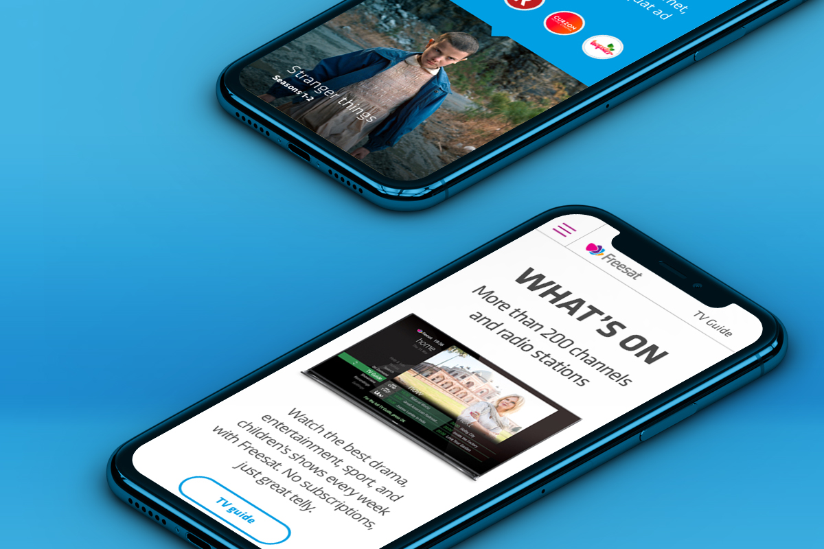
FreesatWeb design
Real estate web designGeneral Projects 2017