Moonpig
Look and feel
Moonpig
Look and feel
Freesat
Web design
Moonpig
Look and feel
Agency - Moonpig
Year - 2018
Role - Art direction/UI design
Credits - Ellie Pujol
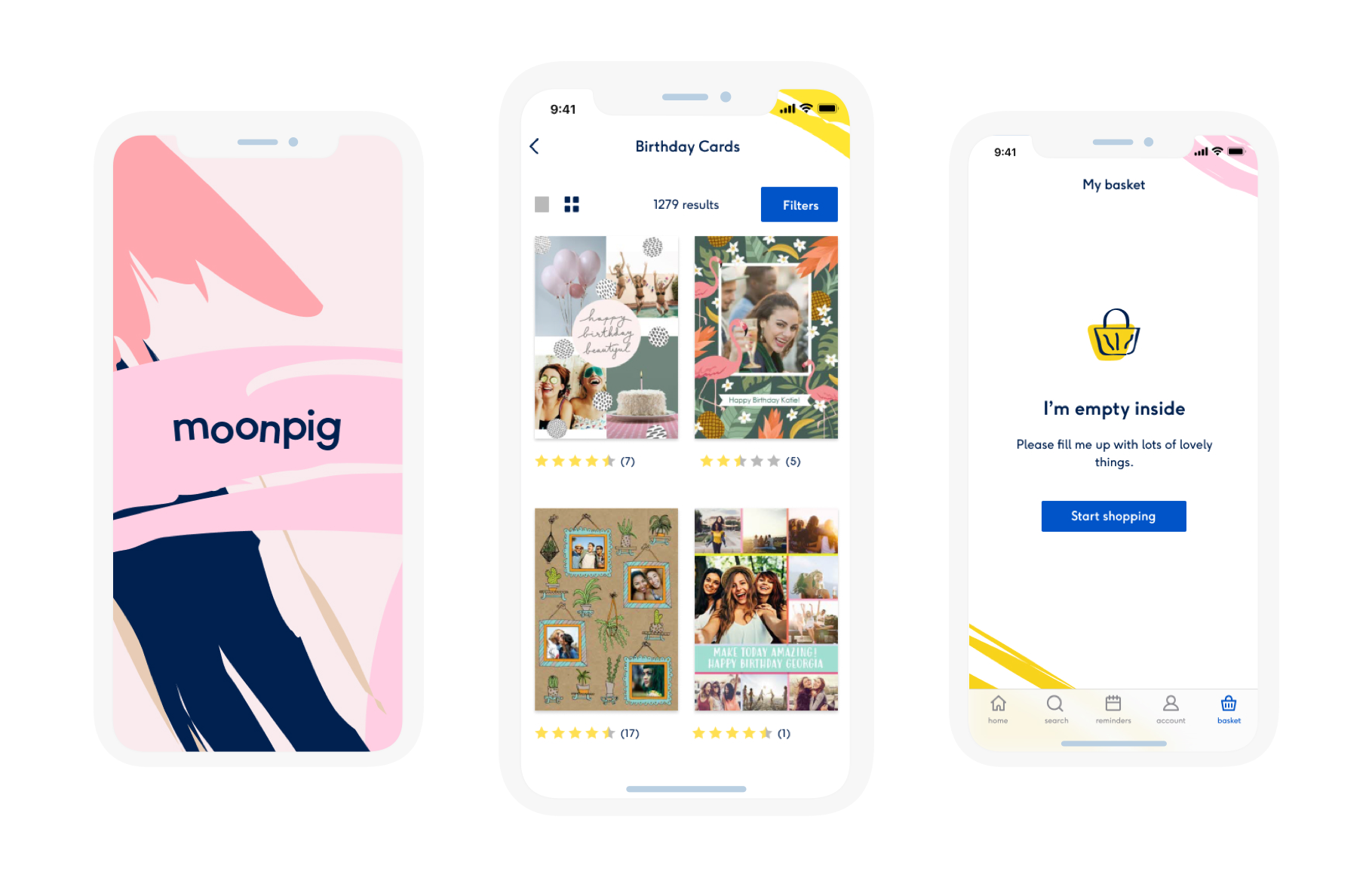
Moonpig is an online retailer known for its personalized greeting cards, gifts, and flowers. Offering a wide range of customizable designs, Moonpig provides a convenient way to celebrate special occasions with heartfelt messages and photos.
The brief
At Moonpig, the design team was given the task of redefining the look and feel of the website and apps.
The brief was to work in pairs to create different visual routes. I worked with Ellie Pujol, exploring colours, typography, layout, textures and iconography to create a consistent user experience.
Identifying the problem
We started analysing the current look and feel of Moonpig in order to identify what was working and what was not. During the investigation, we soon came to the conclusion that there were several key flaws:
Inconsistency of visual styles.
No clear brand positioning.
Horror vacui (from the latin: Fear of empty space).
Unclear hierarchy of elements.
Accessibility problems.
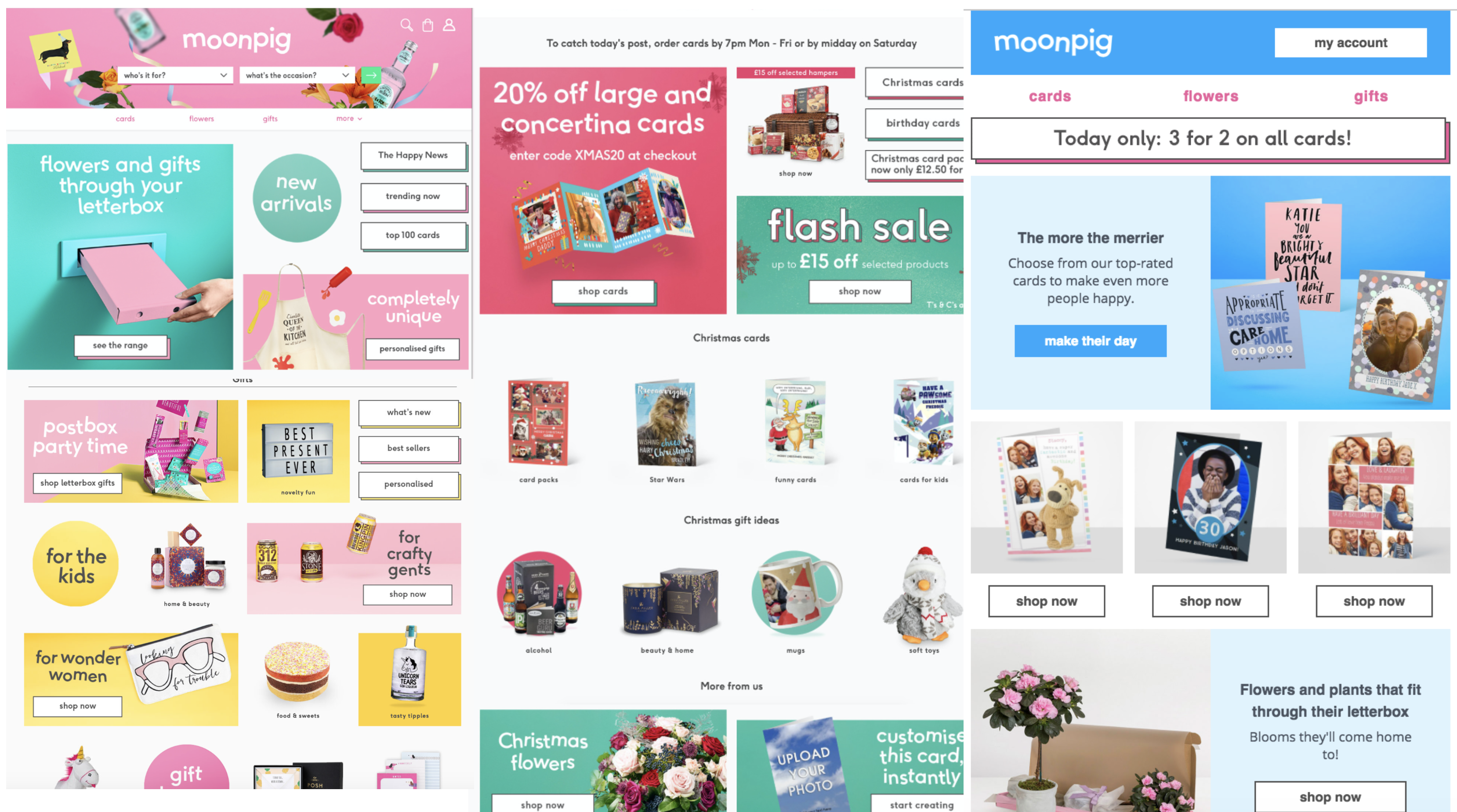
Moonpig's current look and feel.
Defining the brand positioning
Based on the brief and our wider knowledge of the company, Ellie and I concluded that Moonpig's look and feel should embody the following characteristics.
Friendly, approachable, crafty, clean.
Friendly, approachable, crafty, clean.
Examples of look and feels that we liked.
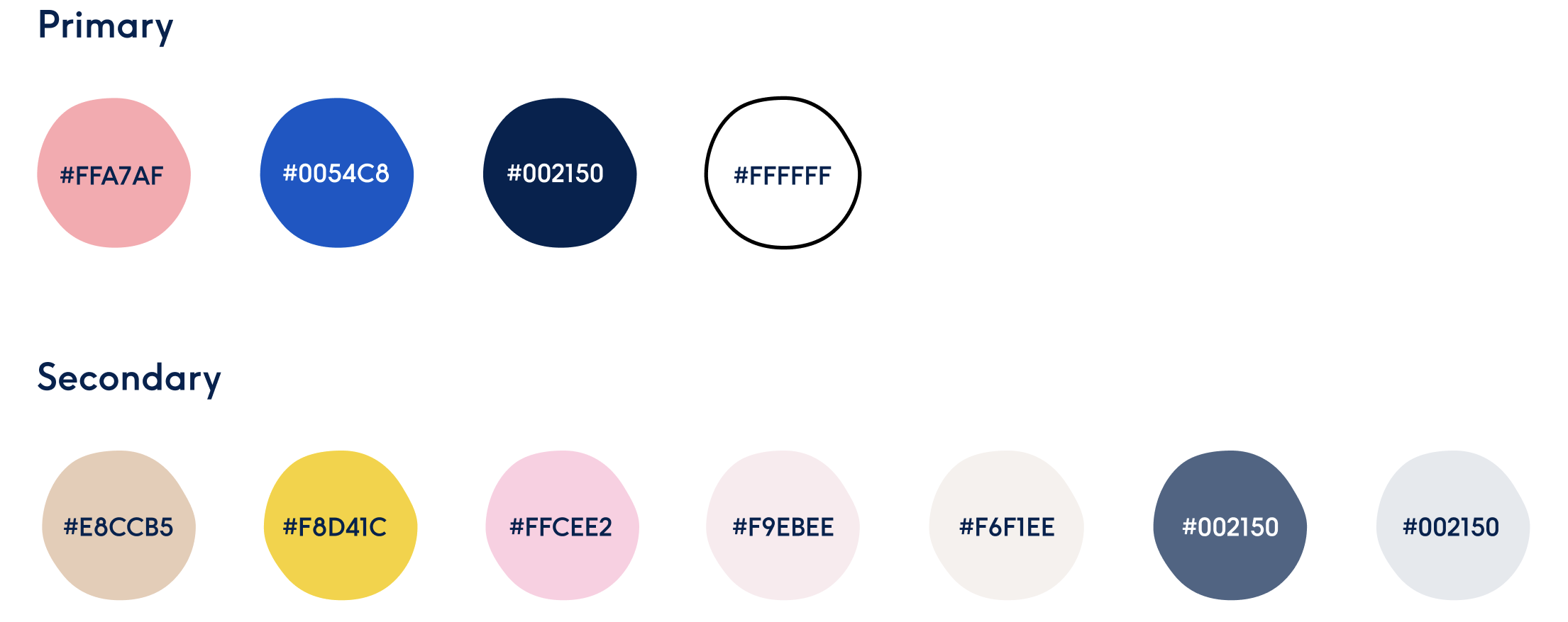
Colour palette
As a starting point, we were given two colours to form the basis of the brand colour palette. It was then up to us to decide how they should be used and what new colours would work best alongside them.
Our main goal was to create a colour palette that reached an AA Accessibility level, while still keeping the characteristics that Ellie and I wanted to reflect in the brand. To achieve this, we created new mixes of the two primary colours as well as new secondary colours. These new tones helped us to generate stronger contrasts between texts and backgrounds.
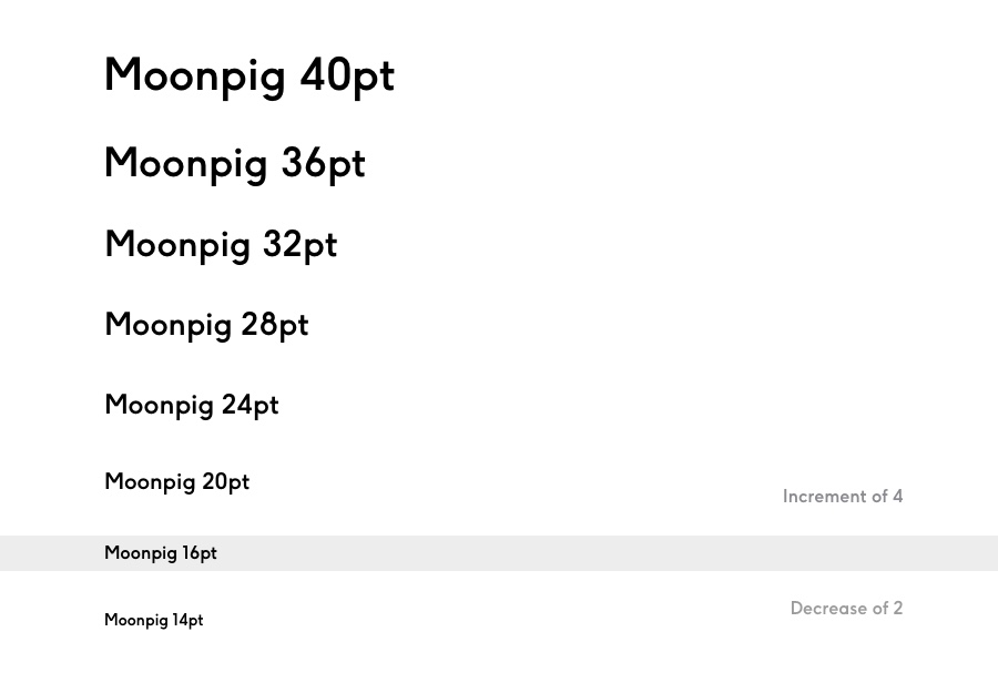
Typography
Moonpig already had a font that was specifically designed for them and worked well with the brand image.
We focused on how it should be used, creating a typographic scale that complied with AA standards as well as creating a visual hierarchy. For accessibility, we chose to set the body copy size at a baseline of 16 points. Above it, the font size would increase at increments of 4 points, while below that we chose to set 14 points as our absolute minimum.
Layout
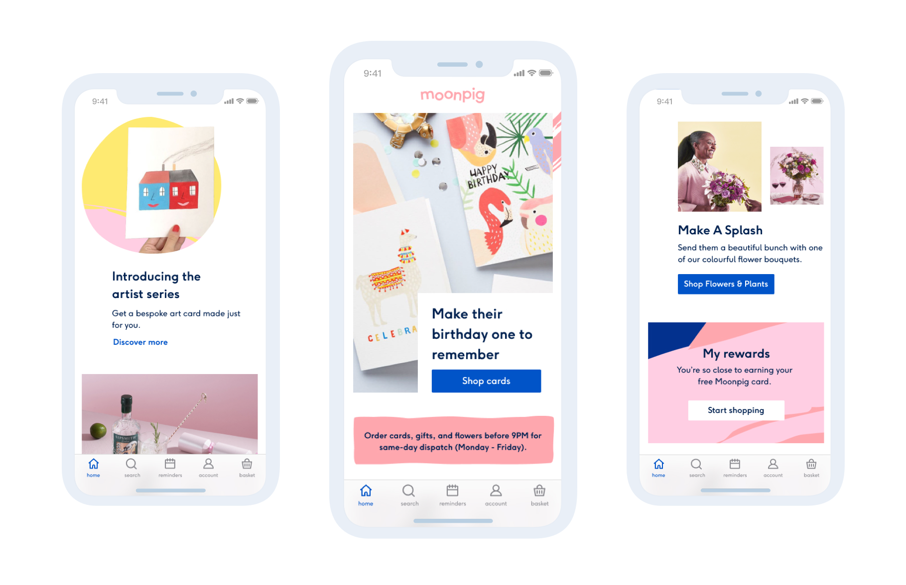
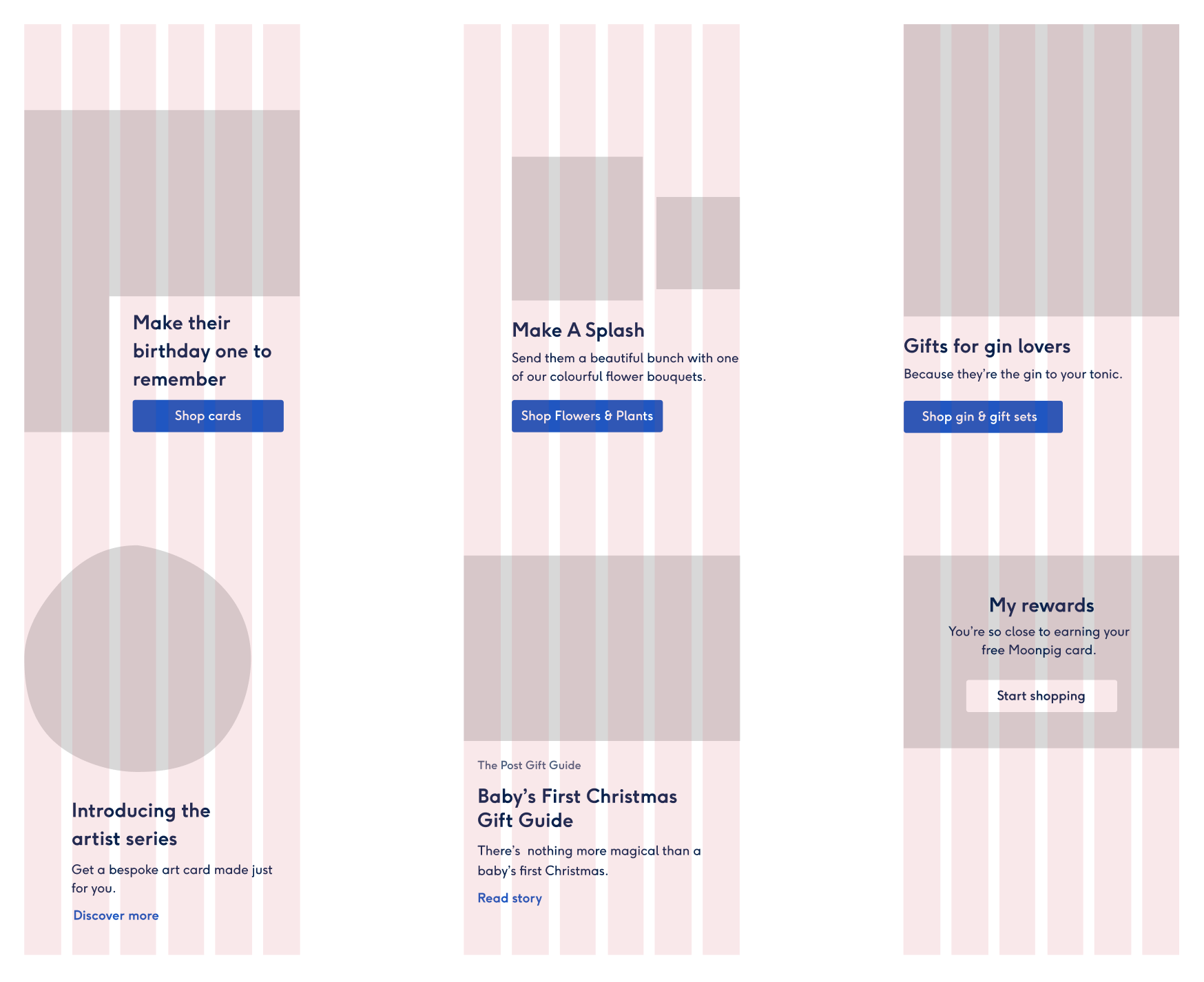
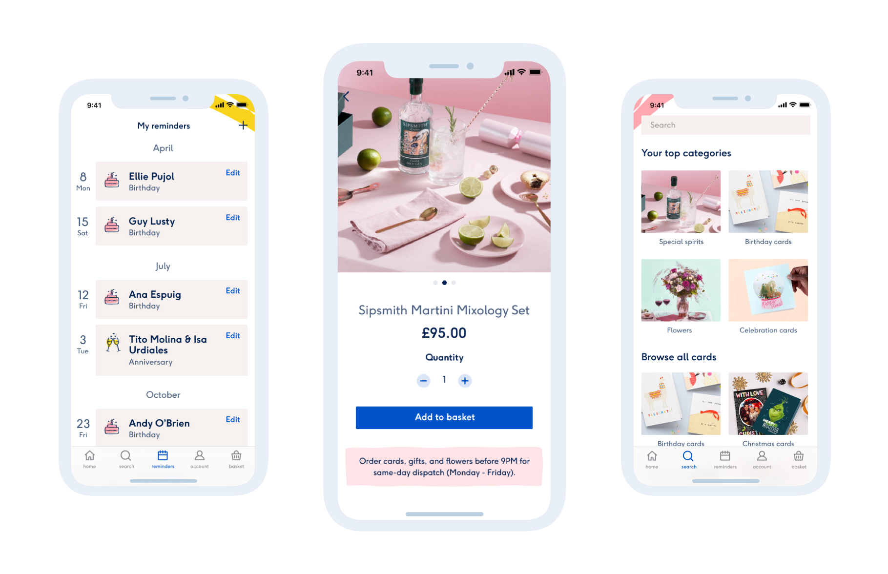
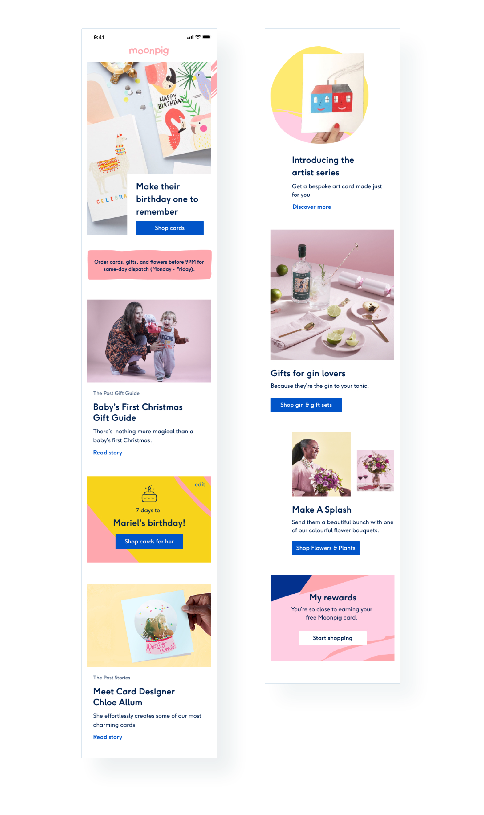
Being mobile first, we wanted to create a layout that brought dynamism and flexibility to the design, even when stacking content on small devices.
To do so, we designed a series of modules that could work in any order and that would fit within a varying amount of columns. We also chose to play with empty space and to use different shapes to contain images, which added visual balance and variety to the layout.
Brand elements
In order to bring a sense of craftiness into the designs we introduced a series of brush stroke backgrounds.
These designs harkened back to the origins of greeting cards, where people handwrite messages and add their own little doodles. We chose to use them to highlight specific content, and at other times simply as small visual details to bring delight into the design.
To compliment these backgrounds, we also developed a concept for illustrative icons using similar wobbly lines and shapes.
Putting it all together
While working on all the aspects of the look and feel, Ellie and I wanted to keep the UI as clear as possible in order to guide users through their different journeys. Therefore, we only used the brush strokes and illustrative icons where pertinent, letting the product visuals take the spotlight.
More projects

Media share and managementStreamYard iOS app 2024

Crypto platform redesignQredo 2023

Checkout redesignMoonpig 2020

iOS app and website designSun racing 2019

Student accomodation websiteNido collection 2017
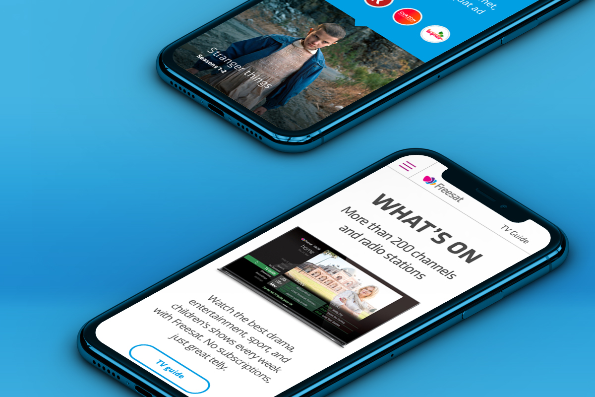
FreesatWeb design
Real estate web designGeneral Projects 2017