Moonpig
Checkout flow
Moonpig
Checkout flow
Moonpig
Checkout flow
Moonpig
Checkout flow
Company - Moonpig
Year - 2019-2020
Role - Senior Product Designer
Company - Moonpig
Year - 2019-2020
Role - Senior Product Designer
Agency - Moonpig
Year - 2019-2020
Role - Senior product designer
Moonpig is one of the biggest e-commerce platforms in UK selling personalised greeting cards along with gifts and flowers. During my time there, I worked on multiple crossfunctional squads and across a varied amount of new features. One of them being a total redesign of the checkout flow.
Moonpig is one of the biggest e-commerce platforms in UK selling personalised greeting cards along with gifts and flowers. During my time there, I worked on multiple crossfunctional squads and across a varied amount of new features. One of them being a total redesign of the checkout flow.
Moonpig is one of the biggest e-commerce platforms in UK selling personalised greeting cards along with gifts and flowers. During my time there, I worked on multiple crossfunctional squads and across a varied amount of new features. One of them being a total redesign of the checkout flow.
THE BRIEF
Moonpig’s checkout flow had been originally designed with one single scenario in mind: A user who buys one single card (most of the cases, a birthday card).
This made sense when the strategy of the company was to serve that behaviour. However, as Moonpig evolved, a new strategy was put in place: Increase the number of High Value Customers (HVC).
What defines HVCs:
- Frequency: 3x more frequent than the average customer.
- Spend value: 6x higher than the average customer.
- Attach rate*: 15x higher than the average customer.
In order to fulfill the company strategy, the checkout flow needed to make the experience of buying multiple items as easy as possible for the user.
*Attach rate: The number of units of a secondary product the business sells with each major product. In Moonpig's case the major product consists of greeting cards and secondary products are gifts and flowers.
IMPACT
An A/B test revealed a 4.5% increase in the spend value, leading to a full 5% increase upon rolling out the feature.
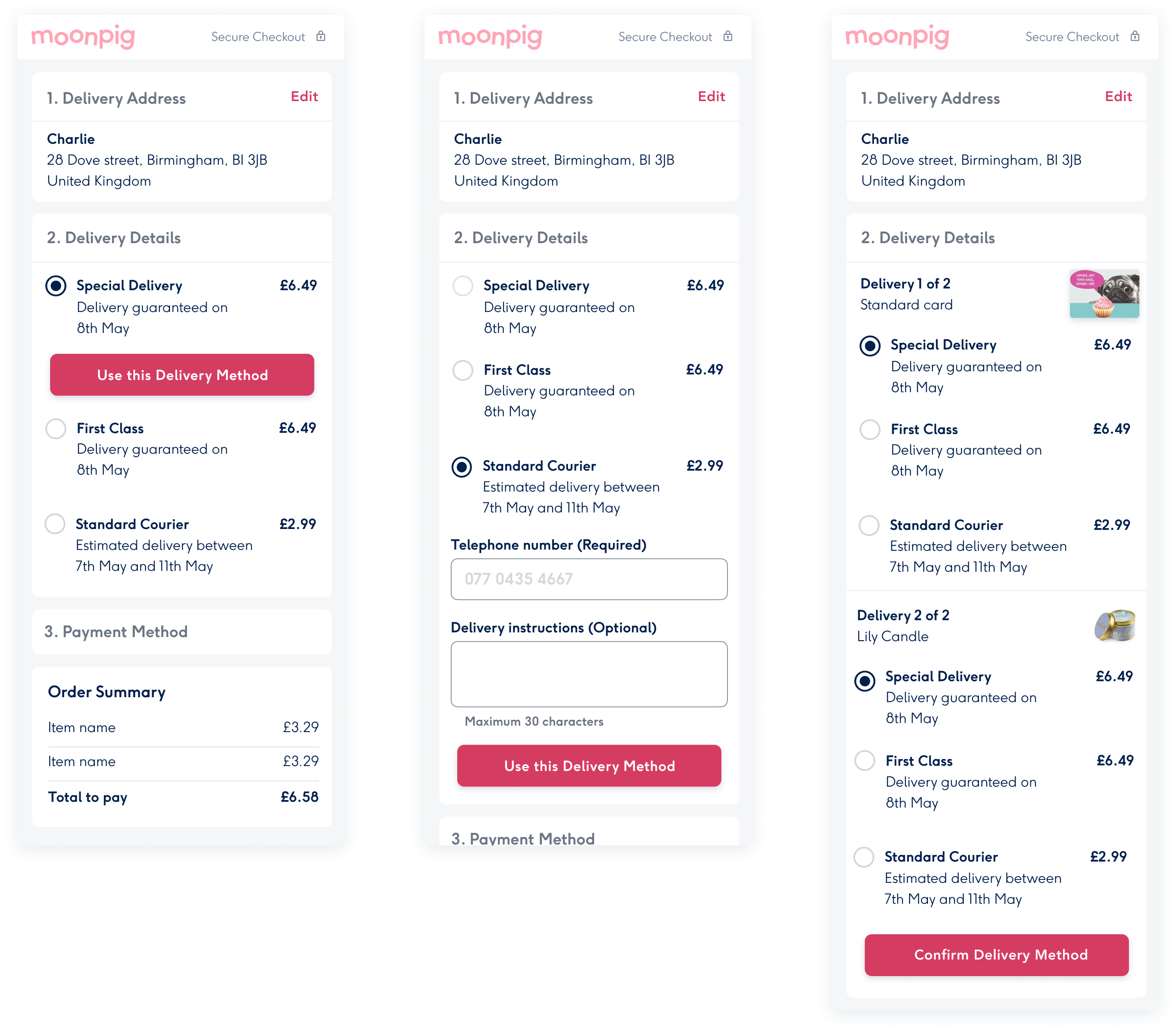
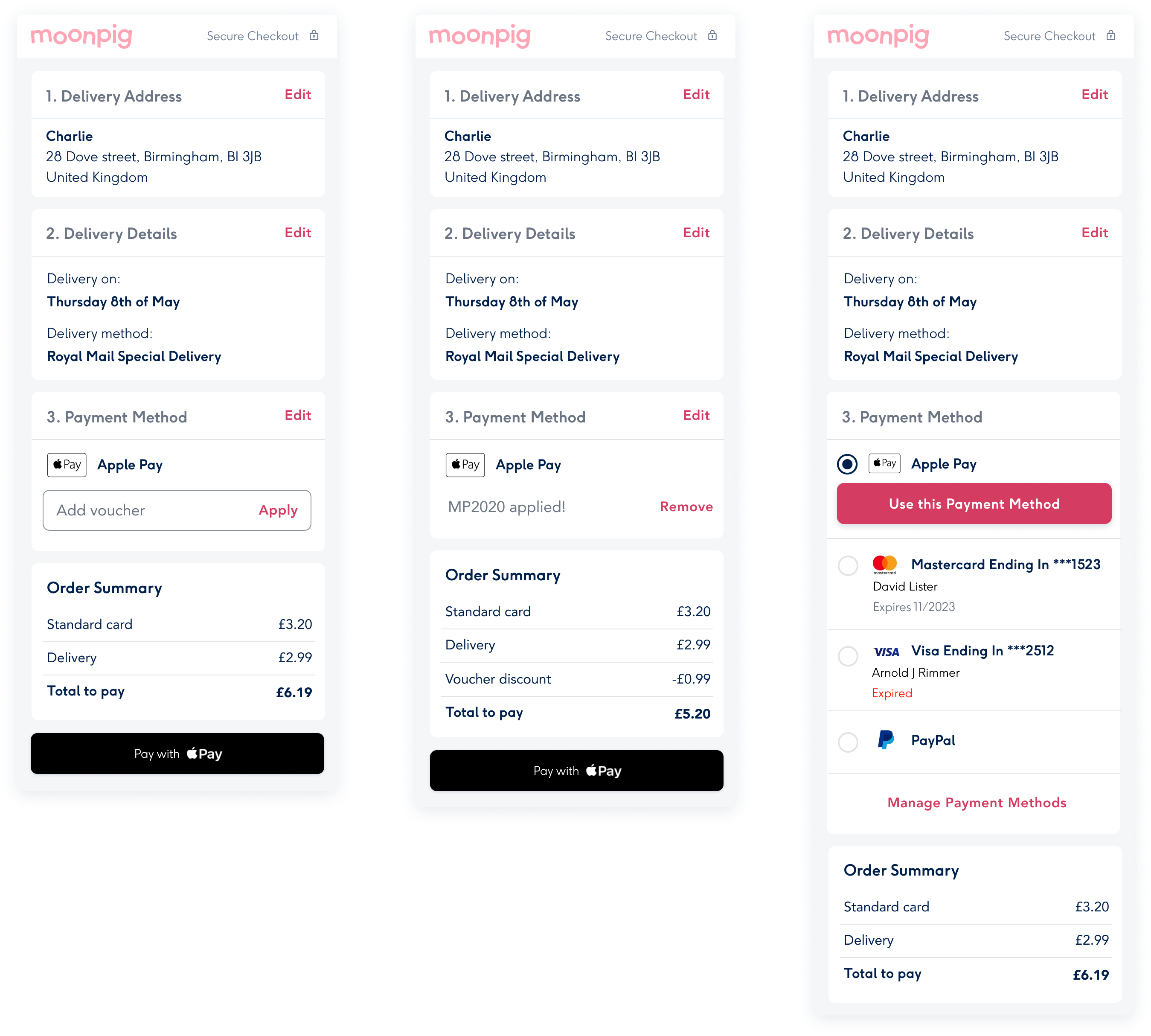
CURRENT JOURNEY AND PAIN POINTS
I first analised the current flow in order to highlight the pain points the user could face.
Long journey.
Basket and checkout concepts confusingly merged.
There's no functionality to go back to check provided details (risk of error).
Flow focuses on buying one card, forcing user to input delivery details for each individual item in the basket.
Several times, CTAs [ ‘continue to basket’] take customers to an extra step rather than the basket.
I first analised the current flow in order to highlight the pain points the user could face.
- Long journey.
- Basket and checkout concepts confusingly merged.
- There's no functionality to go back to check provided details (risk of error).
- Flow focuses on buying one card, forcing user to input delivery details for each individual item in the basket.
- Several times, CTAs [ ‘continue to basket’] take customers to an extra step rather than the basket.
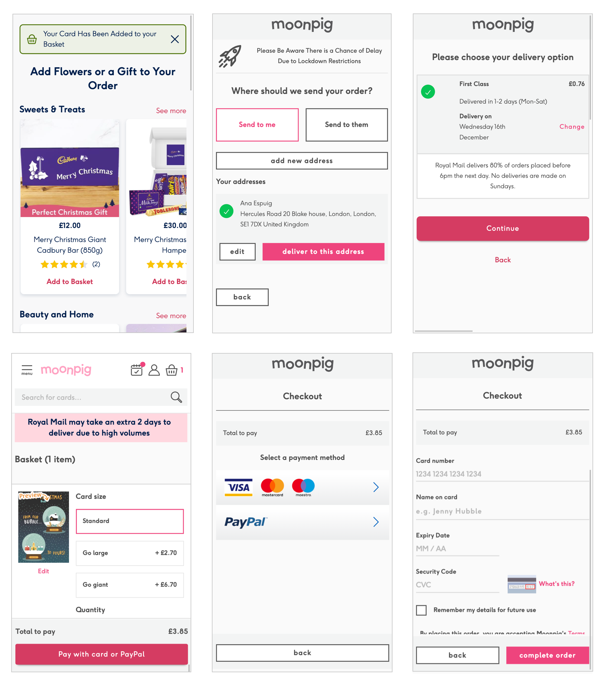
Screenshots of the current flow.
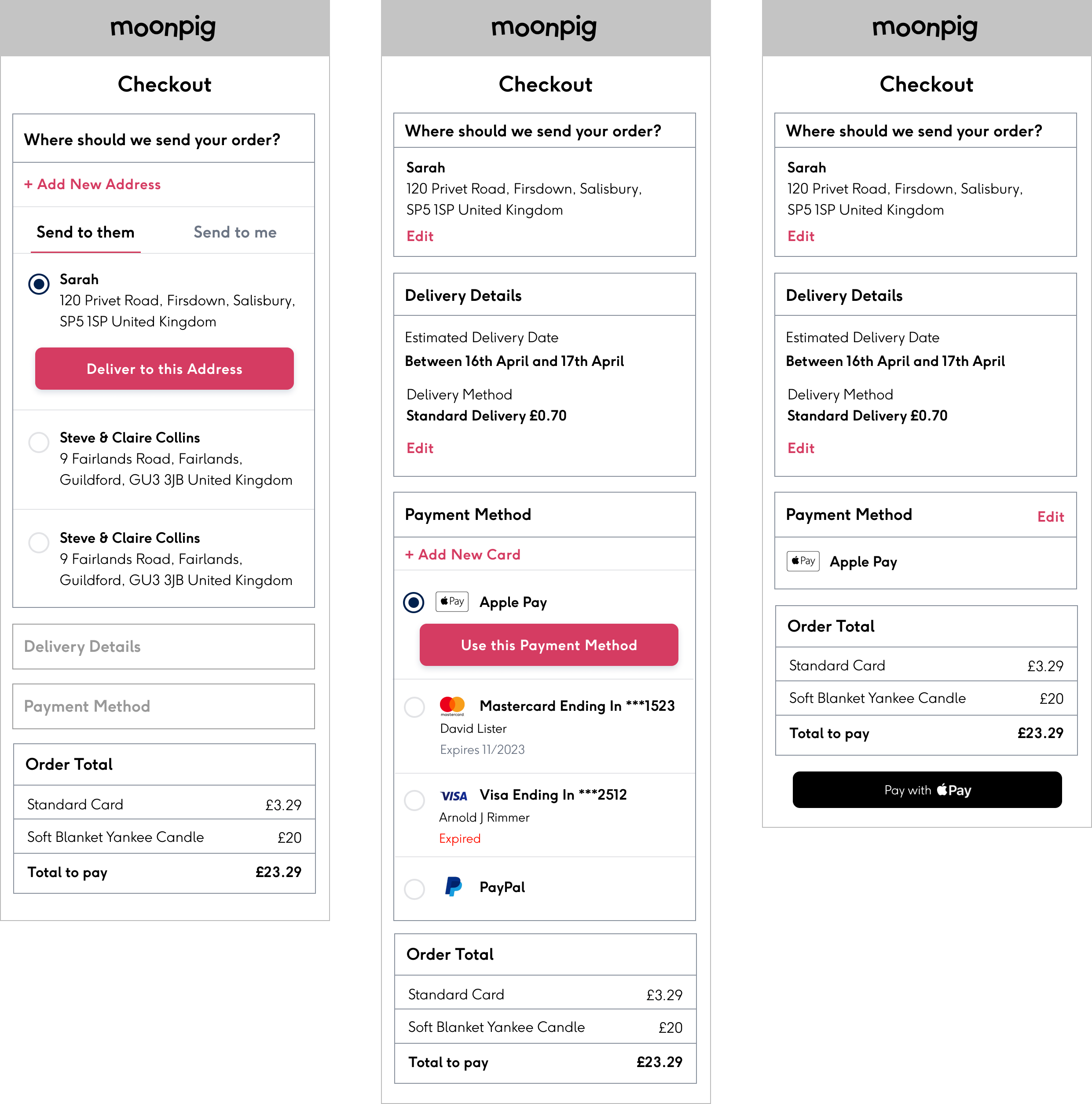
HYPOTHESIS
Based on the pain points that I found on the current flow and on looking at the insights from the competitor research I did, I designed a one page accordion with the hypothesis that we could solve the listed problems based on the following:
It helps users to review their typed information.
It offers users a seamless way to edit that order information.
It allows users to see the next step in the checkout process.
It allows users to add multiple items to the basket before checking out so they only have to do this once.
Defaulting options where possible and having less pages makes the flow easier and faster.
User experience more closely aligned with expectations set on other ecommerce sites.
UNMODERATED TESTING
To check if the hypothesis that the one page accordion would solve the pain points and would answer the brief, I prepared a remote usability test comparing a prototype of the current flow and the new proposed flow
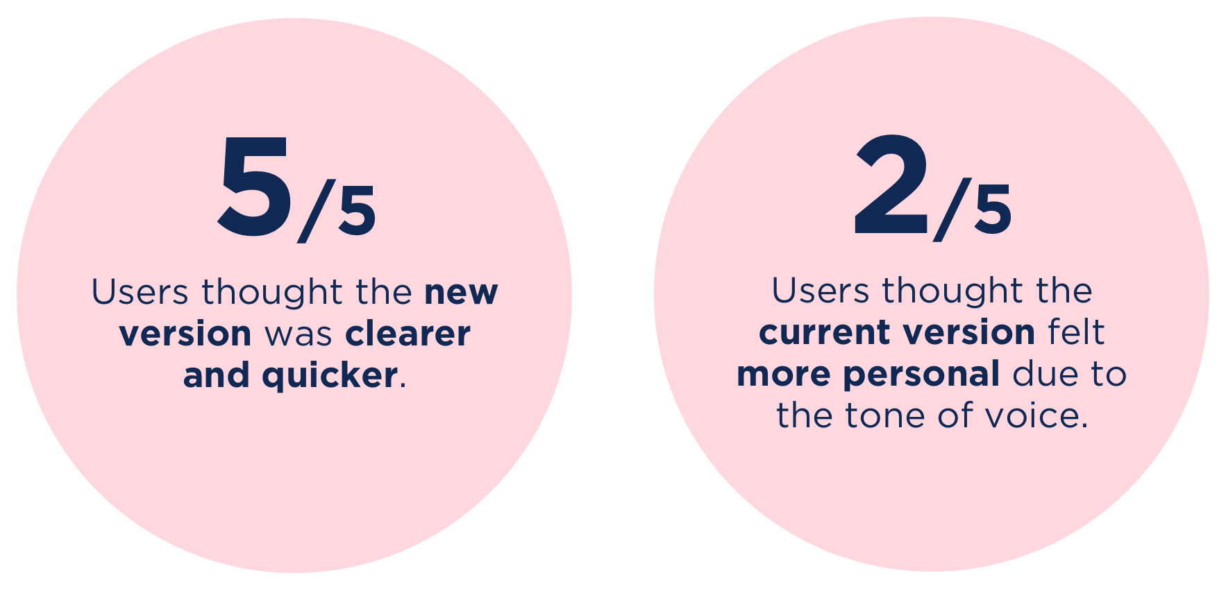
MODERATED TESTING
Based on the previous results I tweaked the new version to have a more similar tone of voice to the current one.
This time, with the help of the UX researcher at Moonpig, we prepared a moderated test with 8 participants (all Moonpig customers) to further validate the conclusions from the unmoderated test.
All 8 participants prefered the new check-out flow (vs. current) as it offers customers a simplified, cleaner experience.
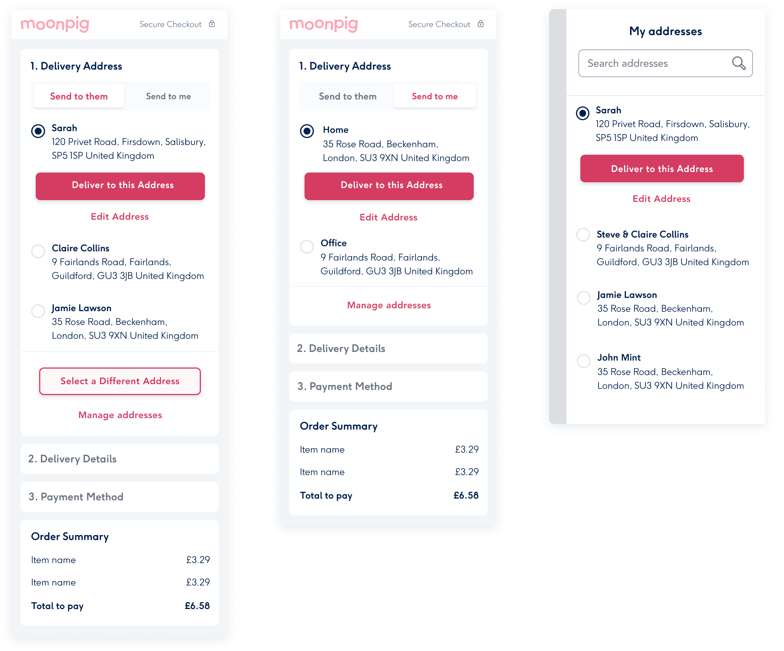
FINAL DESIGNS
More projects

Media share and managementStreamYard iOS app 2024

Crypto platform redesignQredo 2023

Defining a new look & feelMoonpig 2018

iOS app and website designSun racing 2019

Student accomodation websiteNido collection 2017
FreesatWeb design
Real estate web designGeneral Projects 2017