Qredo
Web app redesign
Qredo
Web app redesign
Qredo
Web app redesign
Qredo
Web app redesign
Company - Qredo Ltd
Year - 2021-2023
Role - Lead Product Designer
Qredo is a crypto start-up focused on providing institutions and traders a secure way to store their assets through blockchain technology and multi-party computation (MPC). It also offers secure Web3 transactions through its integrations with MetaMask Institutional, WalletConnect, Celestia and SUI.
Qredo is a crypto start-up focused on providing institutions and traders a secure way to store their assets through blockchain technology and multi-party computation (MPC). It also offers secure Web3 transactions through its integrations with MetaMask Institutional, WalletConnect, Celestia and SUI.
Qredo is a crypto start-up focused on providing institutions and traders a secure way to store their assets through blockchain technology and multi-party computation (MPC). It also offers secure Web3 transactions through its integrations with MetaMask Institutional, WalletConnect, Celestia and SUI.
MY ROLE
As the Lead Product Designer at Qredo, I led the direction for UI and UX patterns during the app redesign, as well as the look and feel, guiding two mid-level product designers on the process.
We crafted a user-centric design strategy, establishing clear UX and UI guidelines and fostering consistency.

HOW IT ALL BEGAN
The product design team became pioneer of the project that would see an entire re-platforming of the app.
As we set out to add new features to the existing web app, we quickly realised that it wasn't built with scalability in mind. Designing these new features became increasingly tricky as a result.
This led us to a discovery exercise where we scrutinised the current design in search of pain points and broken patterns. We did this hand in hand with the research team and the insights from Customer Service.
When we presented the first concepts to the C-level team, the excitement got them into moving the cogs to create a team of product, design and engineering to see the re-design and re-platforming project come to life.
And so 'Purple Rain', our code name for the project, was born.
CHALLENGES
During the time Purple Rain was underway as a side project, Qredo experienced a phase of rapid scaling, taking the company from about 35 employees to nearly 200.
As the project scaled, new stakeholders needed to be informed and convinced of its priority, and they needed to stay updated on its progress. Additionally, our working methods required updating to match the growth.
The product design team became pioneer of the project that would see an entire re-platforming of the app.
As we set out to add new features to the existing web app, we quickly realised that it wasn't built with scalability in mind. Designing these new features became increasingly tricky as a result.
This led us to a discovery exercise where we scrutinised the current design in search of pain points and broken patterns. We did this hand in hand with the research team and the insights from Customer Service.
When we presented the first concepts to the C-level team, the excitement got them into moving the cogs to create a team of product, design and engineering to see the re-design and re-platforming project come to life.
And so 'Purple Rain', our code name for the project, was born.
OVERCOMING THOSE CHALLENGES
Together with the head of product design, we organised regular reviews to discuss all tasks and scheduling to keep stakeholders informed and up to date.
This approach helped manage expectations and allowed for Q&A about overall progress and scheduling of external communications. A crucial part in this was the improved identification of stakeholders and considering how their motivations and expectations would impact our collaboration with them.
The product design team became pioneer of the project that would see an entire re-platforming of the app.
As we set out to add new features to the existing web app, we quickly realised that it wasn't built with scalability in mind. Designing these new features became increasingly tricky as a result.
This led us to a discovery exercise where we scrutinised the current design in search of pain points and broken patterns. We did this hand in hand with the research team and the insights from Customer Service.
When we presented the first concepts to the C-level team, the excitement got them into moving the cogs to create a team of product, design and engineering to see the re-design and re-platforming project come to life.
And so 'Purple Rain', our code name for the project, was born.
OUTCOME
The process for Purple Rain (renamed to New Qredo) to go live involved internal alpha testing, rigorous dogfooding, and a gradual beta release rollout that began with migrating existing customers. The feedback was positive and we continued to make further improvements over the following months.
In September 2023, our company was struggling to find its place in the market, especially with the tough conditions of the crypto winter. As part of a cost-saving effort, 70% of the workforce was let go in two major lay-offs. Although I wasn’t directly affected, I felt it was the right time to seek new challenges, so I decided to move on to new adventures.
The product design team became pioneer of the project that would see an entire re-platforming of the app.
As we set out to add new features to the existing web app, we quickly realised that it wasn't built with scalability in mind. Designing these new features became increasingly tricky as a result.
This led us to a discovery exercise where we scrutinised the current design in search of pain points and broken patterns. We did this hand in hand with the research team and the insights from Customer Service.
When we presented the first concepts to the C-level team, the excitement got them into moving the cogs to create a team of product, design and engineering to see the re-design and re-platforming project come to life.
And so 'Purple Rain', our code name for the project, was born.
The initial design insights
Below are examples of some of the most important key insights from the discovery exercise that would set up the entire direction of the project.
Below is an example of some of the most imporant key insights from the discovery exercise that would set up the entire direction of the project.
Below is an example of some of the most imporant key insights from the discovery exercise that would set up the entire direction of the project.
Below is an example of some of the most imporant key insights from the discovery exercise that would set up the entire direction of the project.
Below are examples of some of the most imporant key insights from the discovery exercise that would set up the entire direction of the project.
FLOWS
Flows required users to undertake an excessive number of steps in a single interaction, therefore augmenting cognitive load, elevating the potential for errors, and extending the overall time required for task completion.
NAVIGATION
The primary navigation presented challenges in terms of user comprehension due to its reliance on icons only. Additionally, the secondary navigation presented limited scalability and a lack of clarity of the user's position within the app.
The primary navigation presented challenges in terms of user comprehension due to its reliance on icons only. Additionally, the secondary navigation presented limited scalability and a lack of clarity of the user's position within the app.
The primary navigation presented challenges in terms of user comprehension due to its reliance on icons only. Additionally, the secondary navigation presented limited scalability and a lack of clarity of the user's position within the app.
The primary navigation presented challenges in terms of user comprehension due to its reliance on icons only. Additionally, the secondary navigation presented limited scalability and a lack of clarity of the user's position within the app.
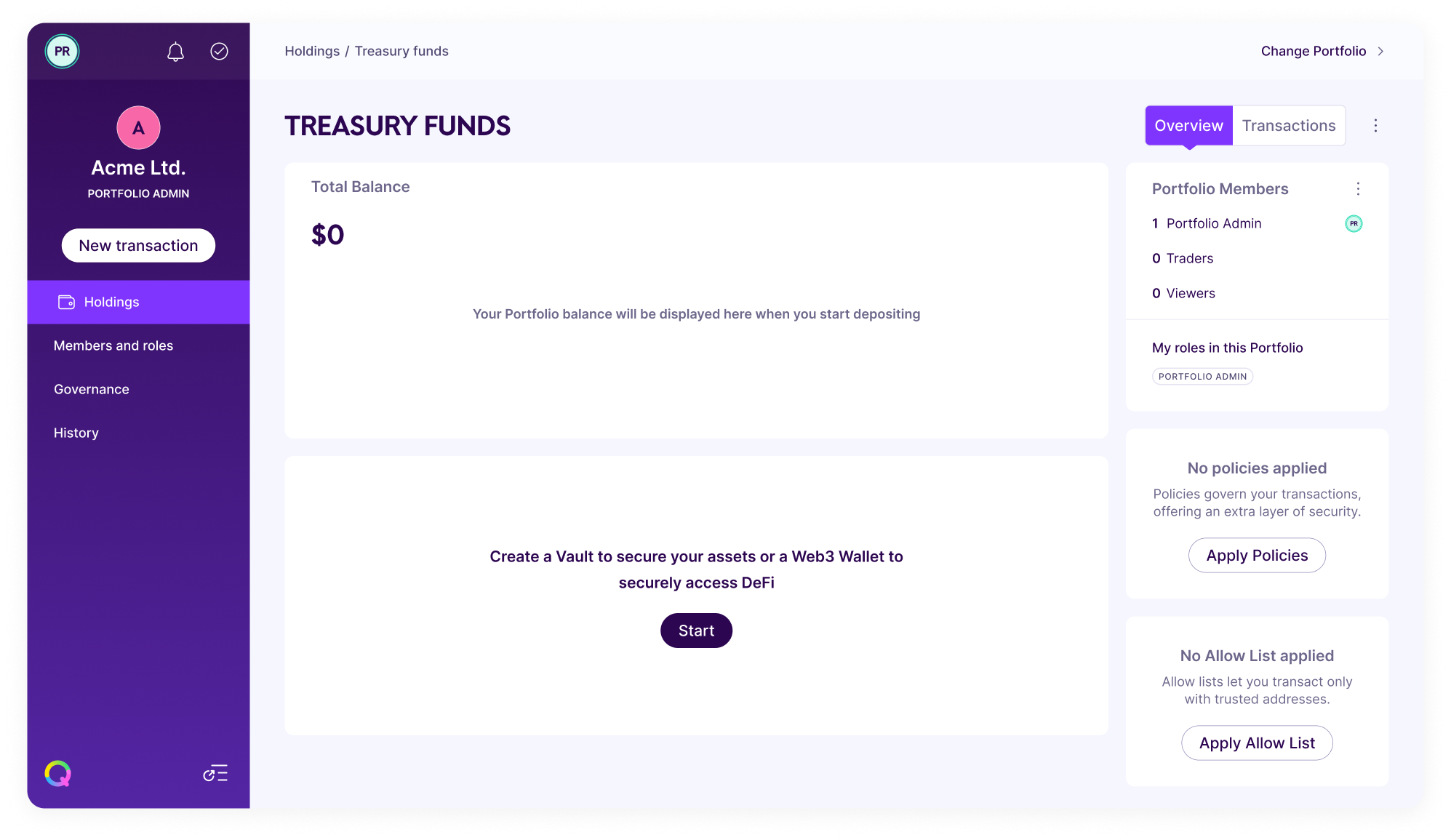
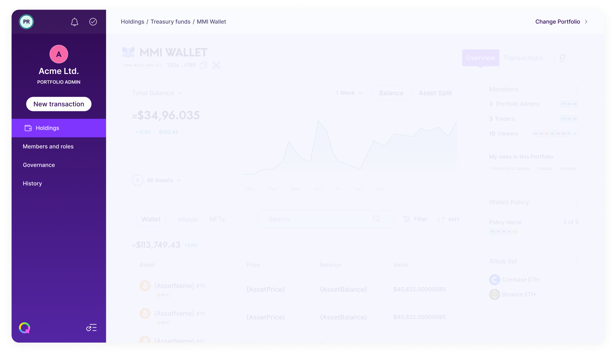
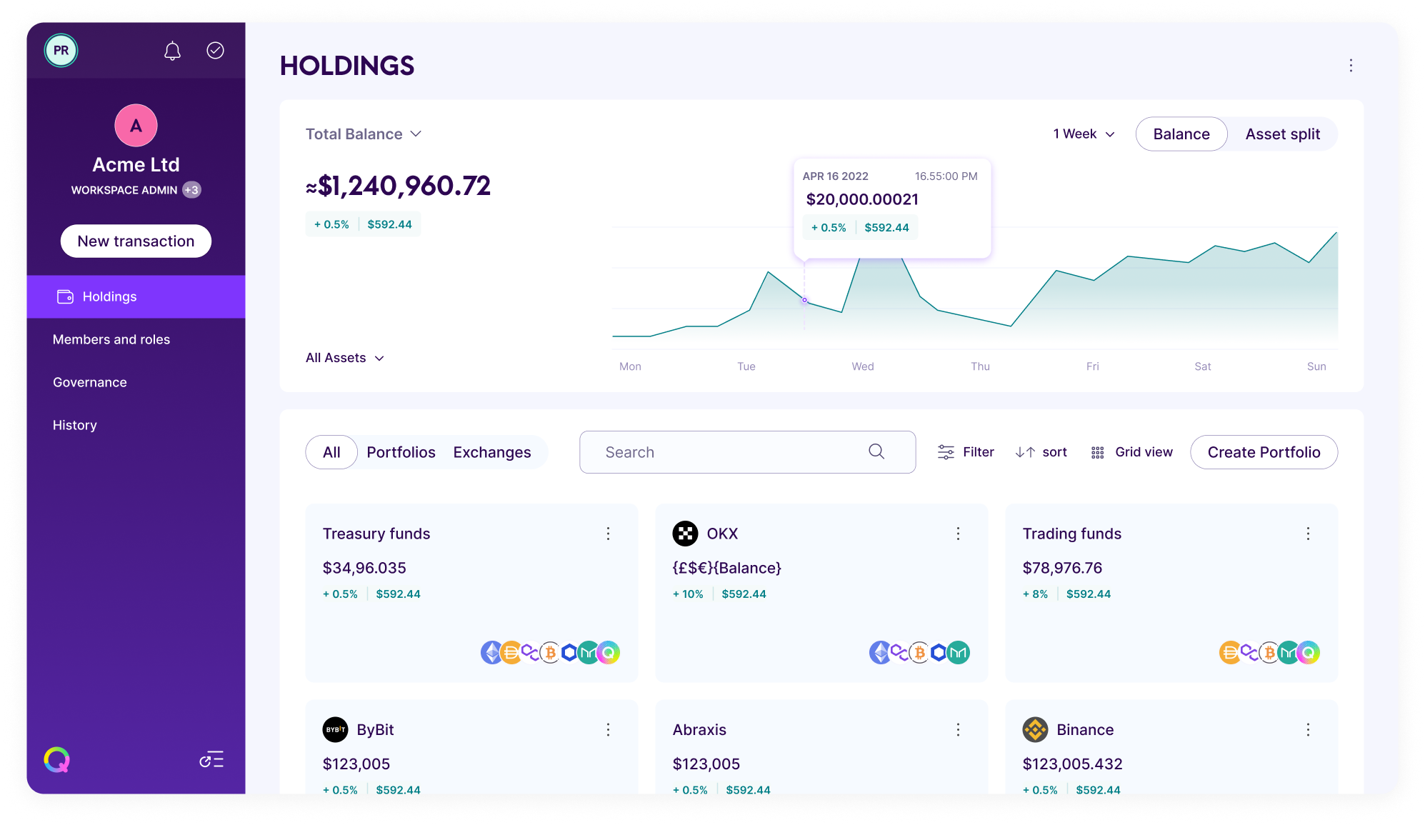
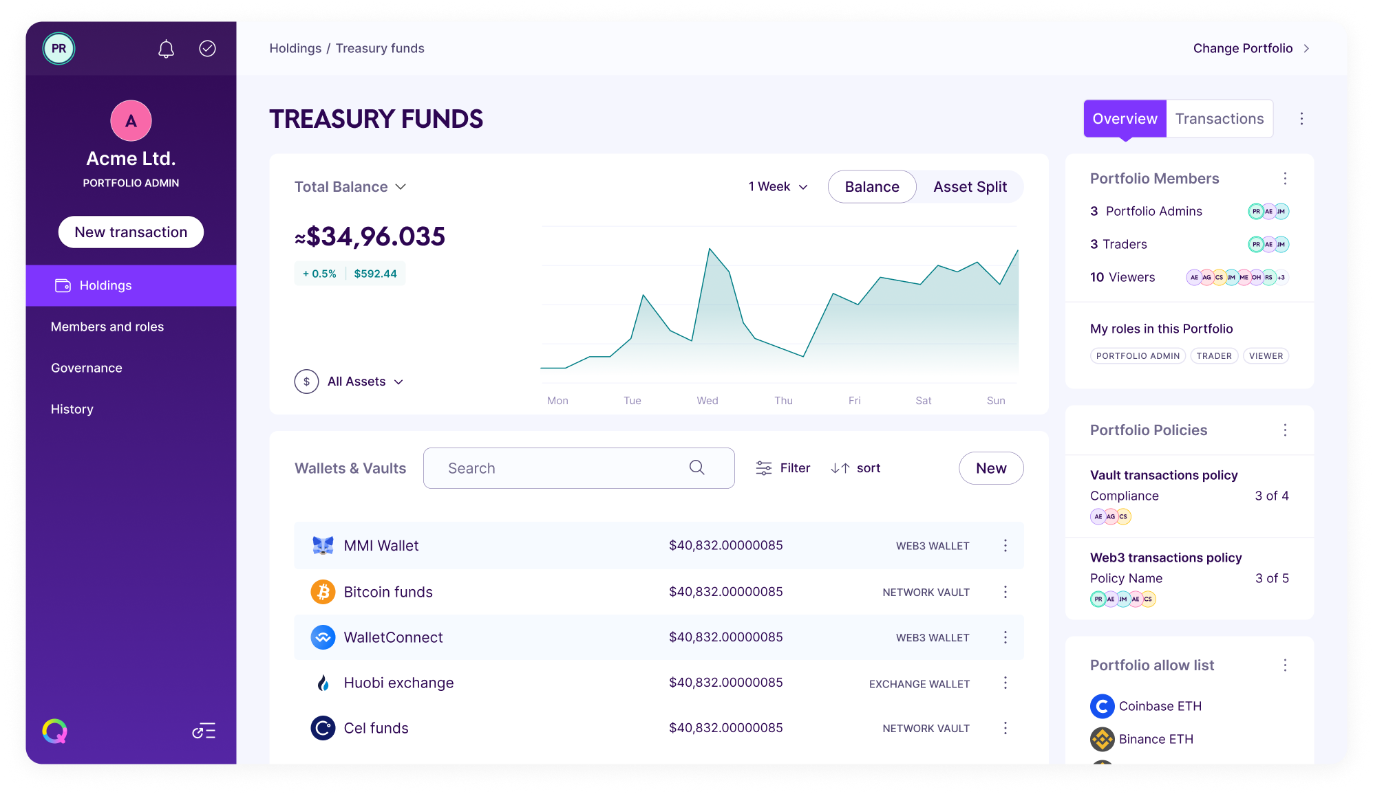
LAYOUT
The web app's layout lacked scalability and relied heavily on numerous tabs and sub-tabs, making navigation challenging as it grew and evolved.
The web app's layout lacked scalability and relied heavily on numerous tabs and sub-tabs, making navigation challenging as it grew and evolved.
The web app's layout lacked scalability and relied heavily on numerous tabs and sub-tabs, making navigation challenging as it grew and evolved.
LOOK AND FEEL
The app was originally designed using a non-descript grey colour palette. This lent a generic aesthetic which did not reflect the richness or vibrancy of the overall brand identity.
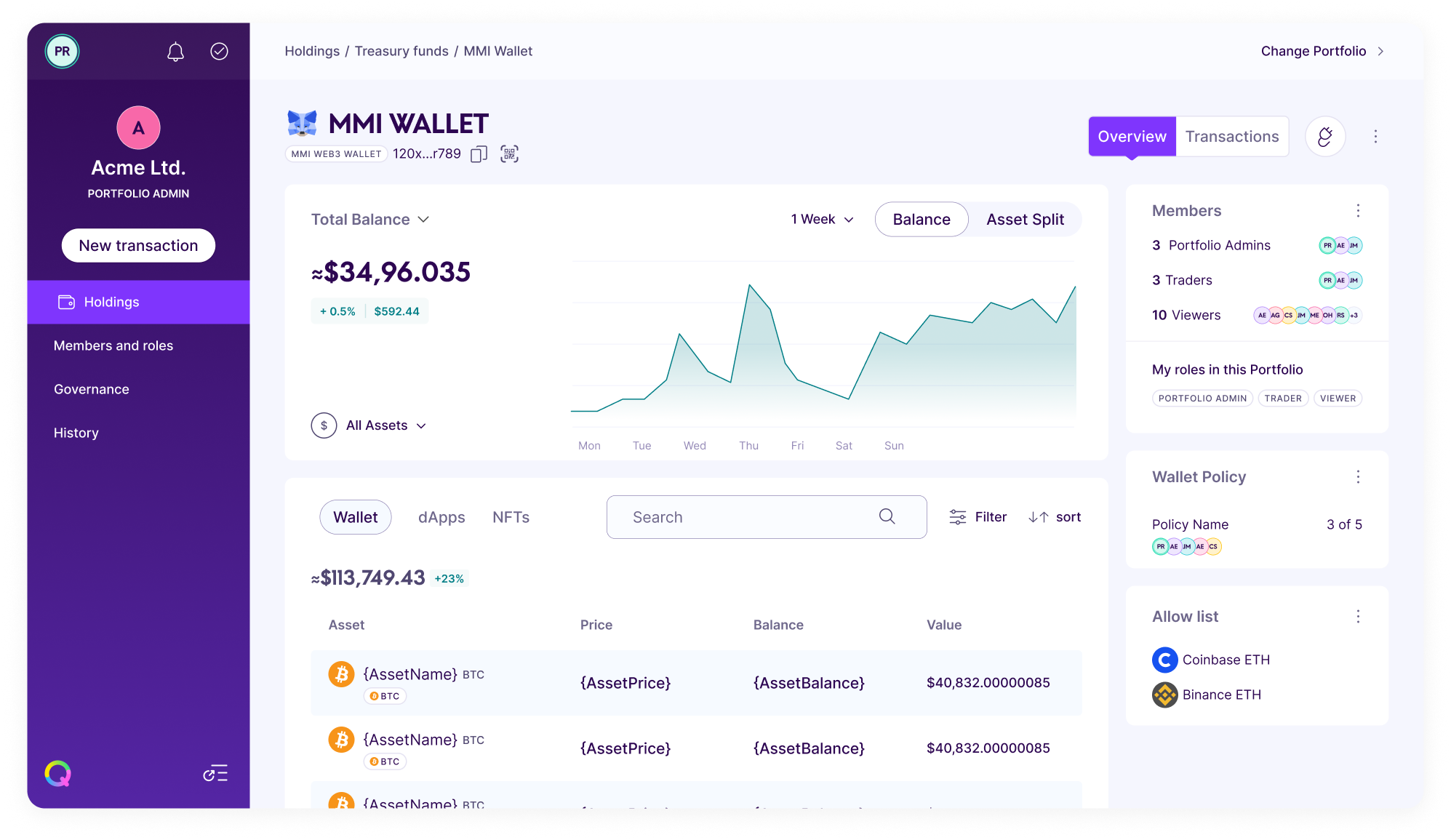
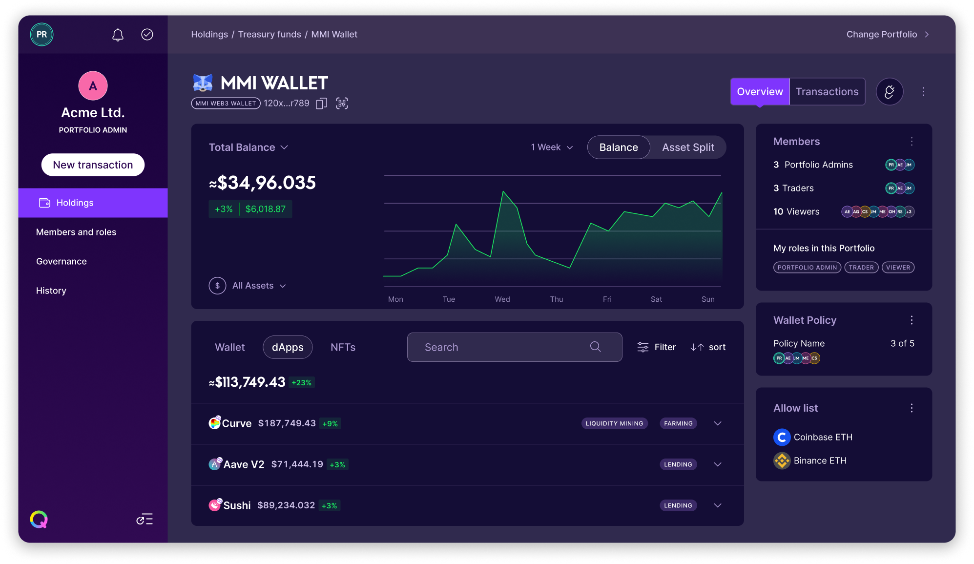
Design outcome
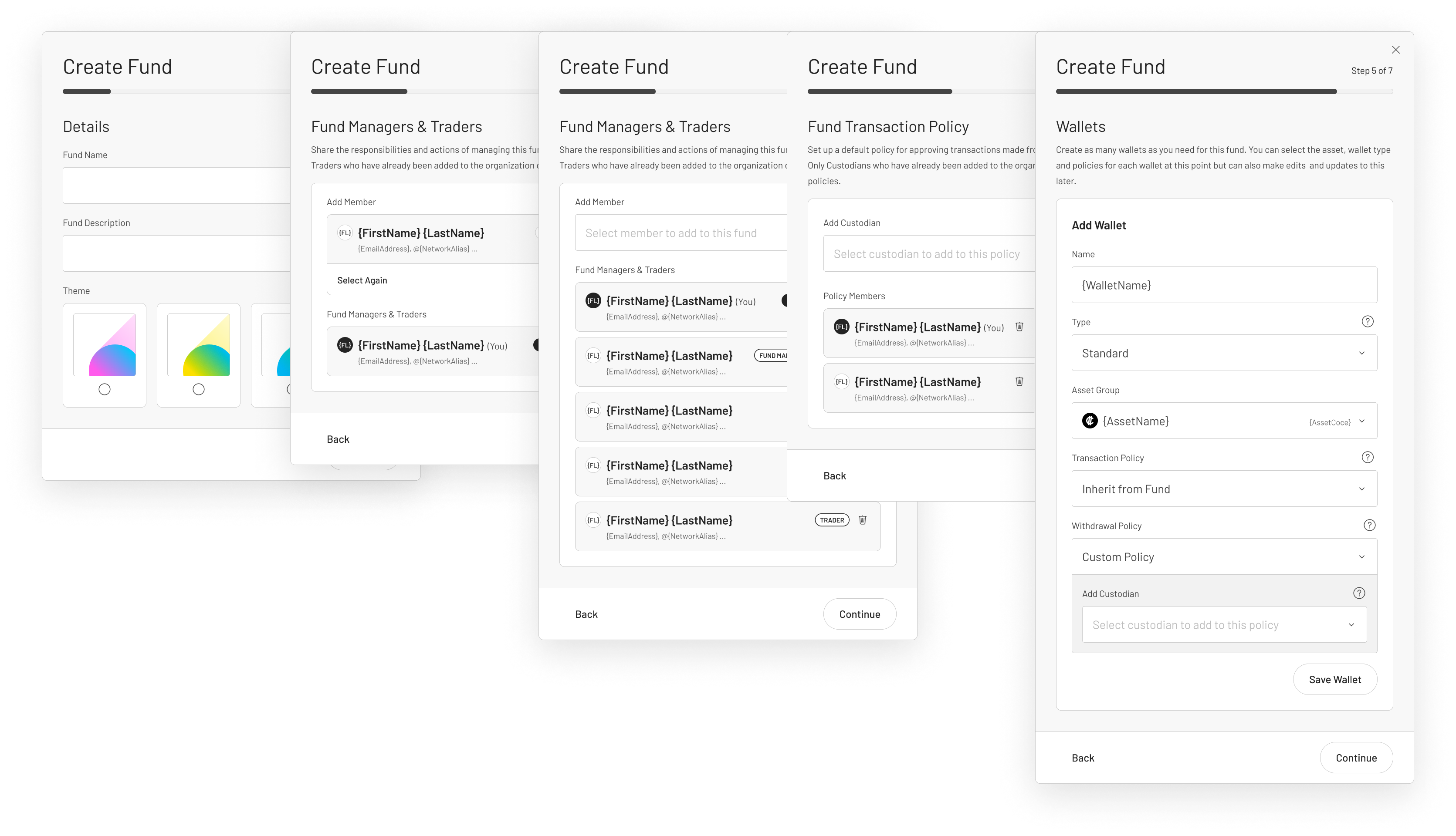
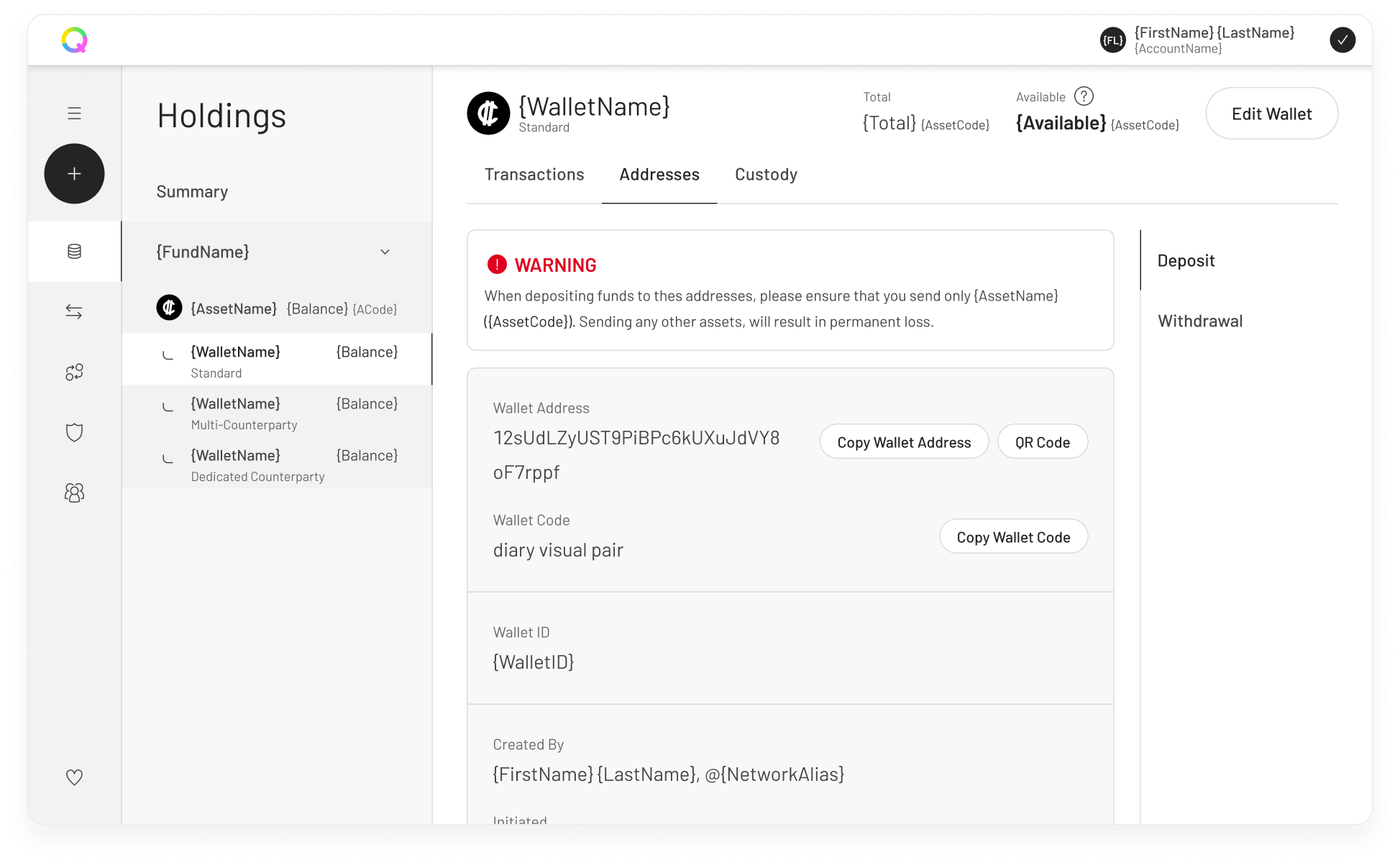
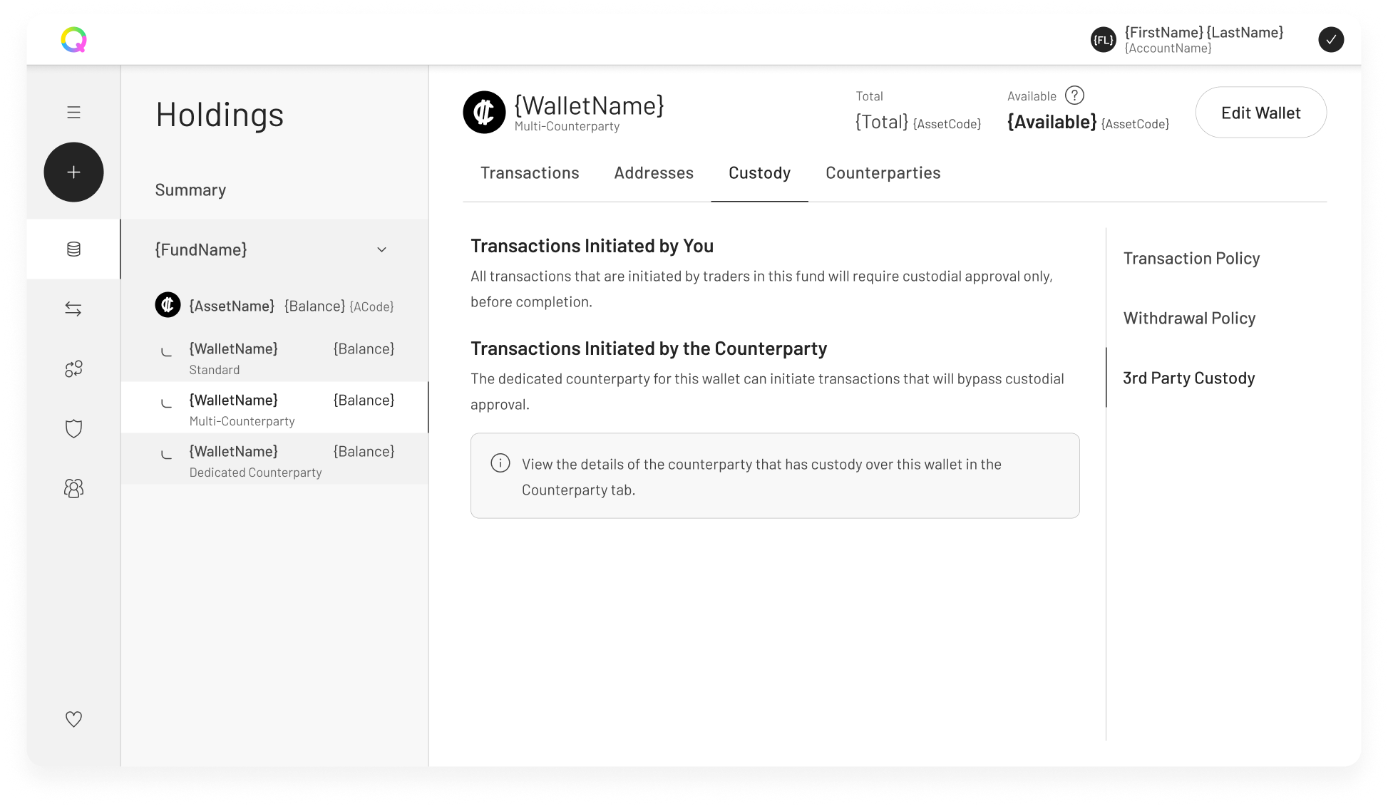
A complete UX and UI redesign of the web app covering the issues found during our exploration and a new design system with accessibility at it's core.
FLOWS
Flows were simplified to only require the minimum information to consider them complete. Once that first step was completed the user was provided with suggestions on next steps. This enabled team collaboration and task delegation within our customer institutions. Empty states were also used to guide the user through different tasks.
NAVIGATION
The app's navigation redesign focused on three key elements: clear separation of navigation and content, the introduction of labels for accessibility, and the incorporation of breadcrumbs for improved user guidance and way finding.
LAYOUT
A dashboard style was adopted for the layout. This enabled a way to consolidate and present more pertinent information on a single page and significantly enhance the hierarchy of elements.
LOOK & FEEL AND UI
The web app's UI redesign placed accessibility at its core while maintaining alignment with brand values and cohesiveness with other brand materials.
The web app's UI redesign placed accessibility at its core while maintaining alignment with brand values and cohesiveness with other brand materials.
The web app's UI redesign placed accessibility at its core while maintaining alignment with brand values and cohesiveness with other brand materials.
Design system
Design system
We developed a design system based on accessibility along with documented UX patterns to ensure consistency. We named it Blocks, harkening back to the idea of blocks that build a blockchain and design system elements being the building blocks of an ecosystem.
Below you can see some extras like examples of the night mode version, log in screens, icons and AA colour palettes.
We developed a design system based on accessibility along with documented UX patterns to ensure consistency. We named it Blocks, harkening back to the idea of blocks that build a blockchain and design system elements being the building blocks of an ecosystem.
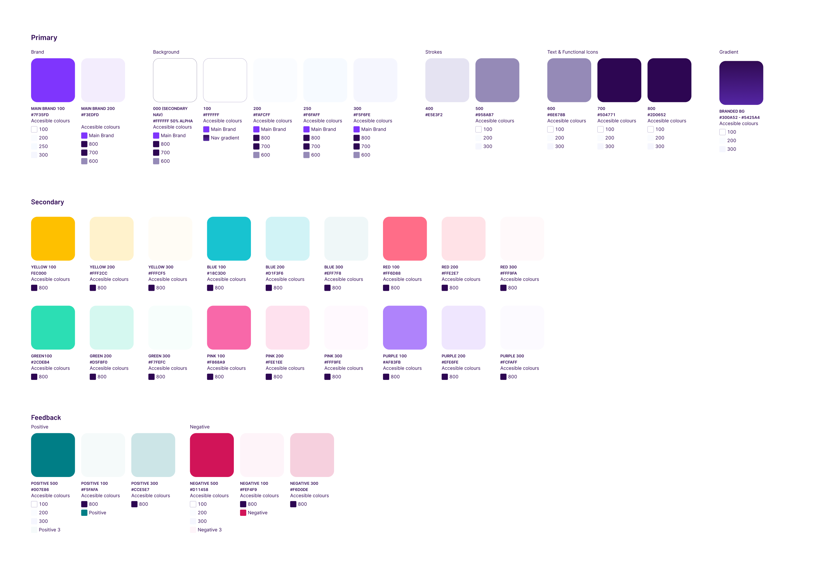
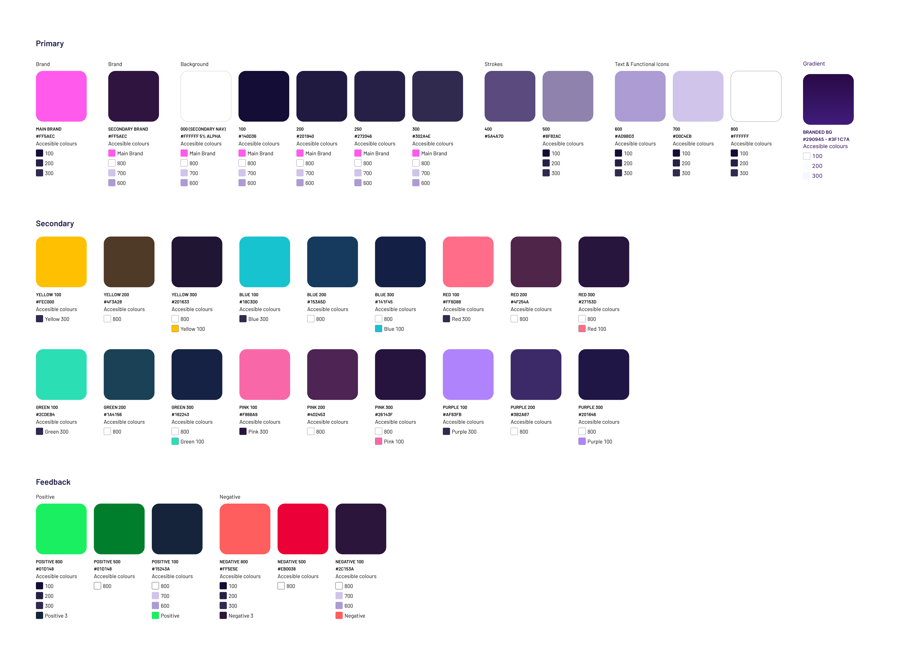
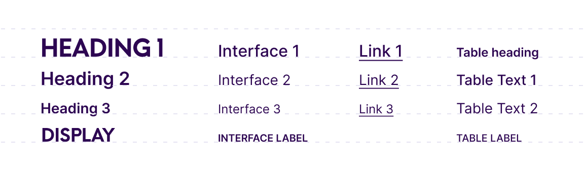
FOUNDATIONS
Foundations
Foundations are the atomic parameters that form the basis of everything to do with Blocks. Colour palette, typography choices, and responsiveness, to name a few.
Read more about Blocks foundations in Notion
Below you can see some extras like examples of the night mode version, log in screens, icons and AA colour palettes.
Foundations are the atomic parameters that form the basis of everything to do with Blocks. Colour palette, typography choices, and responsiveness, to name a few.
Read more about Blocks foundations in Notion
Foundations are the atomic parameters that form the basis of everything to do with Blocks. Colour palette, typography choices, and responsiveness, to name a few.
Read more about Blocks foundations in Notion
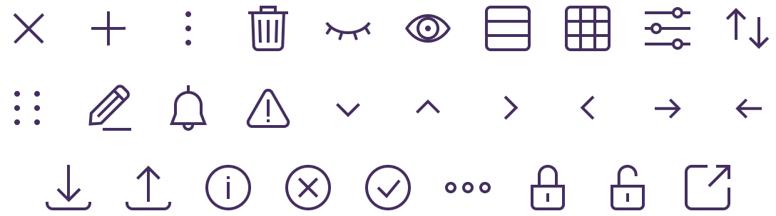
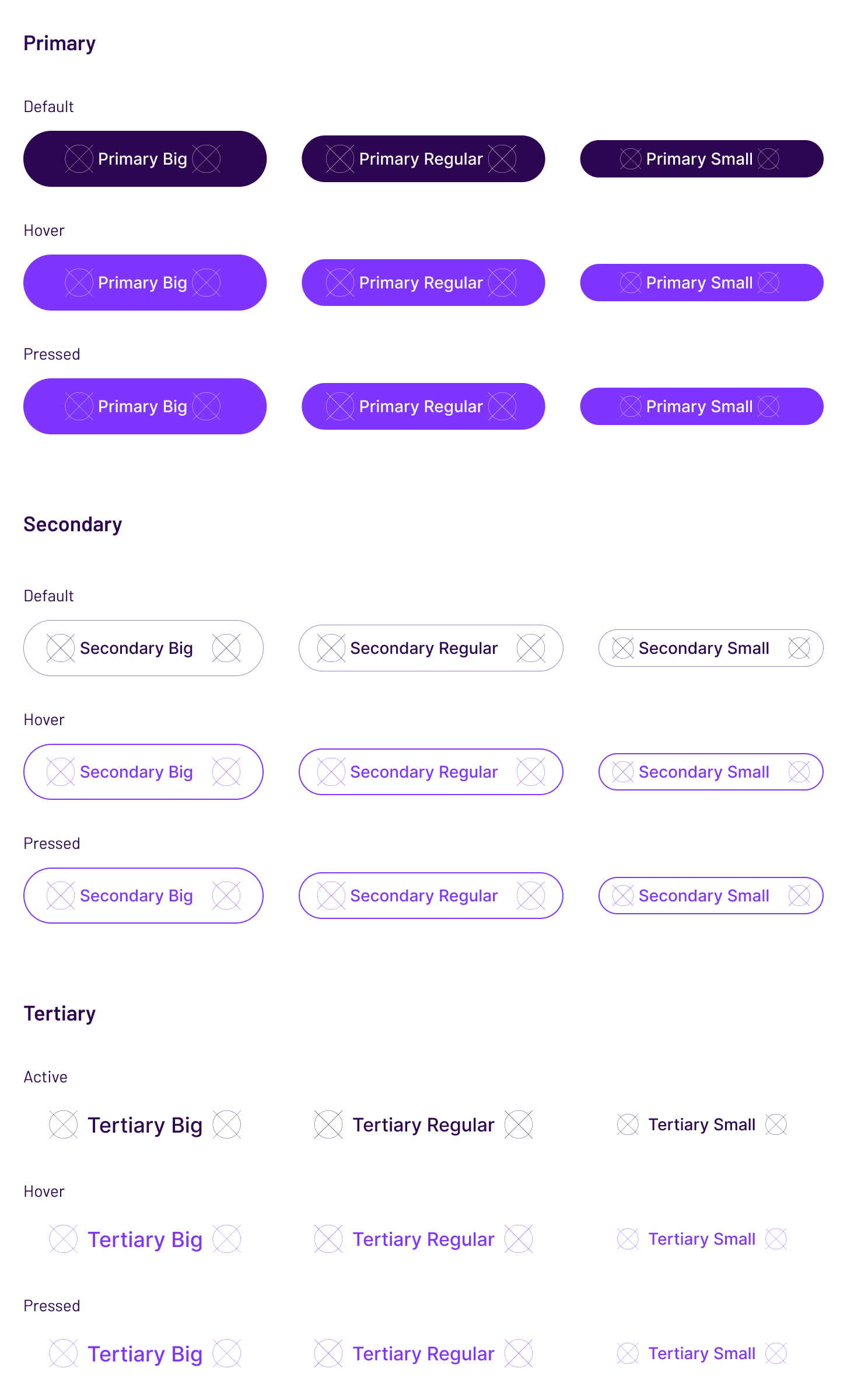
ELEMENTS
Elements
Elements are the nuts and bolts of what a customer interacts with when experiencing a product that has been created with Blocks. Buttons, form elements, Icons & Graphics to mention some are covered. Below you can see some examples of Blocks elements.
Read more about Blocks elements in Notion
Elements are the nuts and bolts of what a customer interacts with when experiencing a product that has been created with Blocks. Buttons, form elements, Icons & Graphics to mention some are covered. Below you can see some examples of Blocks elements.
Read more about Blocks elements in Notion
Elements are the nuts and bolts of what a customer interacts with when experiencing a product that has been created with Blocks. Buttons, form elements, Icons & Graphics to mention some are covered. Below you can see some examples of Blocks elements.
Read more about Blocks elements in Notion
Elements are the nuts and bolts of what a customer interacts with when experiencing a product that has been created with Blocks. Buttons, form elements, Icons & Graphics to mention some are covered. Below you can see some examples of Blocks elements.
Read more about Blocks elements in Notion
Elements are the nuts and bolts of what a customer interacts with when experiencing a product that has been created with Blocks. Buttons, form elements, Icons & Graphics to mention some are covered. Below you can see some examples of Blocks elements.
Read more about Blocks elements in Notion
More projects

Media share and managementStreamYard iOS app 2024

Defining a new look & feelMoonpig 2018

Checkout redesignMoonpig 2020

iOS app and website designSun racing 2019

Student accomodation websiteNido collection 2017
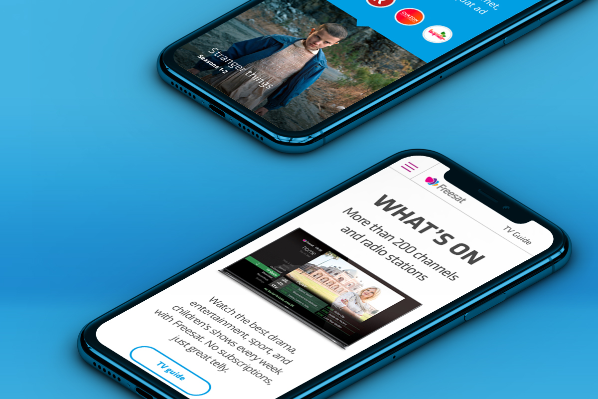
FreesatWeb design
Real estate web designGeneral Projects 2017